For the designer

Design System
Monster Vault

This page gives you everything you need to understand the visual direction of Monster Vault. The app is built and functional. We are looking to refine the identity and elevate the visual quality. Your input on the logo, color palette, and overall feel is what we are after.

The product

What is Monster Vault?

The short version for context.

One line: Instagram + Untappd, but for Monster Energy fans.

Users photograph Monster Energy cans, rate them on three aspects (taste 1-10, can design 1-10, overall experience 1-10), and share reviews in a social feed. The app tracks which flavors you have tried, lets you wishlist flavors you want, and rewards you with MonsterPoints as you review more, climbing through 8 Vault Ranks from Recruit to Overlord.

Platform: iOS (React Native / Expo). Launching soon on the App Store. Target audience: Monster Energy collectors and enthusiasts, predominantly 16-30 years old, into gaming and energy drink culture.
Platform
iOS App
React Native, Expo SDK 54. Full dark mode with light mode support.
Web
Website
monstervault.nl — this landing page. English first, Dutch planned.
Audience
Who it is for
Energy drink fans, collectors, gamers. Bold taste, underground culture.
Tone
Feel
Premium but raw. Collector's pride. Dark, neon, confident.
Branding

Current Logo

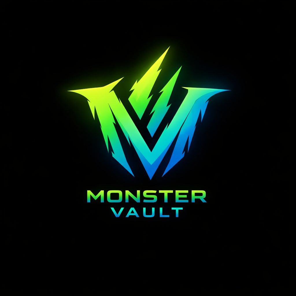
This is the current placeholder logo — an AI-generated "MV" lettermark. It captures some of the right energy (bold, jagged, gradient) but needs refinement for production use.

Current Monster Vault logo on dark background
WHAT WORKS
  • Green to cyan to blue gradient matches the brand
  • "MV" lettermark is readable and compact
  • Aggressive, jagged style fits the energy
  • Works well on dark backgrounds
NEEDS WORK
  • AI look — not refined enough for App Store
  • Doesn't scale well to 16x16 icon sizes
  • No light-mode version
  • Typography below logo is not distinctive
Colors

Color System

The full palette used in the app and on this website.

Monster Green
#39FF14
Primary accent — CTAs, ratings, progress bars
Monster Black
#0A0A0A
Primary background — all dark surfaces
Vault Gradient
#39FF14 to #00E5FF to #0066FF
Special elements, logo concept
Surface
#111111
Cards, post cards, list items
Surface 2
#181818
Nested cards, input backgrounds
Surface 3
#1F1F1F
Borders, separators, track backgrounds
Text Primary
#F2F2F2
Main text — titles, names, numbers
Text Secondary
#999999
Subtitles, descriptions, metadata
Danger Red
#FF3B30
Delete actions, warnings, low ratings (1-3)
Warning Orange
#FF9500
Disclaimers, medium ratings (4-5)
Rating Yellow
#FFCC00
Mid ratings (6-7), Captain rank
Gold
#FFD700
Overlord rank, top achievements
Typography

Typography

The app uses the system default fonts (SF Pro on iOS). The website and design docs use Inter. We are open to a branded typeface — suggestions welcome.

Heading XL
96px / 900 / -4px
Rate.
Heading L
44px / 900 / -1.5px
Flavor Collection
Heading M
22px / 800 / -0.5px
Monster Ultra White
Body
15px / 400-500 / 0px
Rate any Monster Energy flavor on taste, design, and experience. Build your personal vault and climb the leaderboard.
Label / Badge
11px / 700 / +1.5px
Ultra Category
Rating Number
24px / 900
9/10
App UI

Key UI Components

The building blocks of the app, shown here for design reference.

Flavor Card
Ultra
Monster Ultra White
9/10
Original
Monster Energy (Green)
8/10
Juice
Monster Mango Loco
7/10
Taste Rating — NumberRating (1-10)
1
2
3
4
5
6
7
8
9
10
Color scale: red (bad) through orange and yellow to green (great). Button 8 shows the selected state.
Design Rating — SliderRating
Can design 8/10
1510
Vault Rank Bar
Overlord 8.400 MP
84% toward max rank
Vault Rank Chips
Recruit
Grunt
Soldier
Sergeant
Captain
Commander
Warlord
Overlord
Buttons
Badge / Label
Direction

Brand Feeling

Words that describe what Monster Vault should feel like.

Bold
Dark
Neon
Collector's pride
Gaming culture
Underground
Premium
Community-first
Mobile-native
Enthusiast, not corporate
Brands with a similar aesthetic feel
Razer — dark and neon green, aggressive branding
Discord — community-first, dark, clean cards
Untappd — same concept for beer, collector pride
Linear — premium dark SaaS aesthetic, clean typography
Raycast — minimal, premium, gradient accents
Designer brief

What We Need From You

Specific deliverables we are looking for. Open to your vision and suggestions.

1

App Icon (1024x1024px)

The icon that lives on the iOS home screen. Must be readable at small sizes (40x40px). Should work without the "Monster Vault" wordmark.

2

Logo Refinement

Take the "MV" concept further or propose an alternative. We need versions for dark background, light background, and a horizontal wordmark.

3

Color Palette Review

Does #39FF14 (neon green) work as our primary? Open to refinements. Let us know if you would tweak the gradient or suggest an alternative direction.

4

App Store Screenshots

6-8 marketing screenshots for the App Store (6.7" and 6.1" iPhone). Show key screens: feed, flavor detail, rating, profile and ranks.

5

Overall Feedback

Look at the app screens and this website. What feels cheap? What works? Where would you push the visual quality? All input is welcome.

6

Typography Suggestion

The app currently uses system fonts. Would a custom typeface add to the premium feel? If so, which direction would you go?

Contact and Delivery
Questions or feedback? Reach out to Sem at semjansen.langmuur@gmail.com. Preferred format: Figma, Adobe XD, or high-res PNG/SVG exports.